Project Overview
The Rugby food bank is a local non-profit organisation dedicated to providing food assistance for individuals and family in need. The purpose of the project was to redesign the user interface (UI) by improving its usability, and overall user experience.
The new UI will aim to enhance the organisation's online presence,
Streamline the donation process and
Encourage community engagement.

Non-Profit Website
Redesign
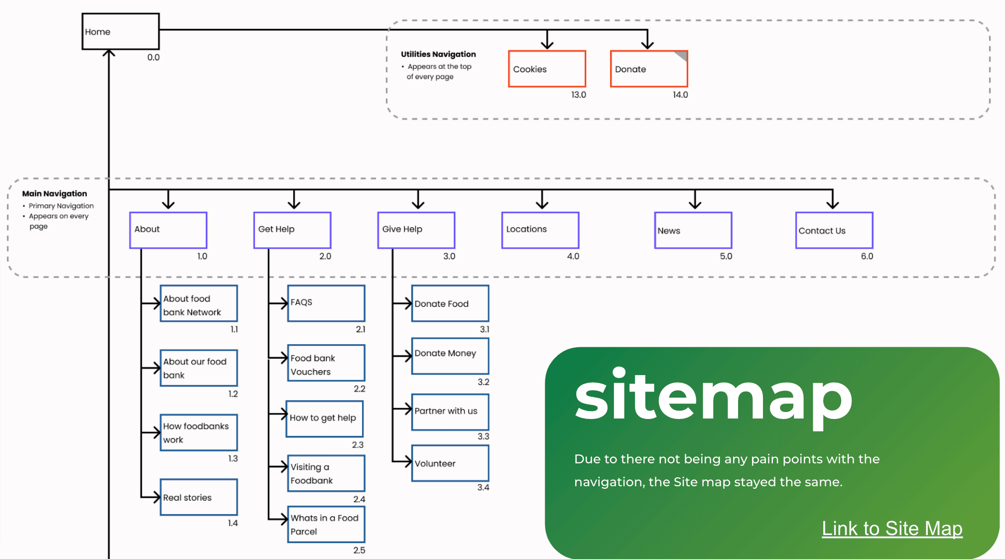
Problem: The Lack of UI element present, and the inconsistent information architecture has disengaged users from performing their goals successfully. Through user research, the author have attempted solving users pain-point..
Solution
. Streamline the information architecture by organizing content in a logical and user-friendly manner. Implement a clear and intuitive navigation menu that allows users to find the information they need easily.
. Establish a consistent design language throughout the website, ensuring that UI elements, such as buttons, forms, and menus, have a unified style and behavior. This consistency enhances user familiarity and reduces cognitive load.
. Use visual cues like color, typography, and spacing to create a clear visual hierarchy that guides users' attention to the most important elements and actions. Prioritize the information and features that align with the users' goals and make them easily accessible.
Impact:
Improved User Engagement.
Enhanced User Experience.
Increased Conversion and Donations.
Positive Brand Perception.
Greater Accessibility
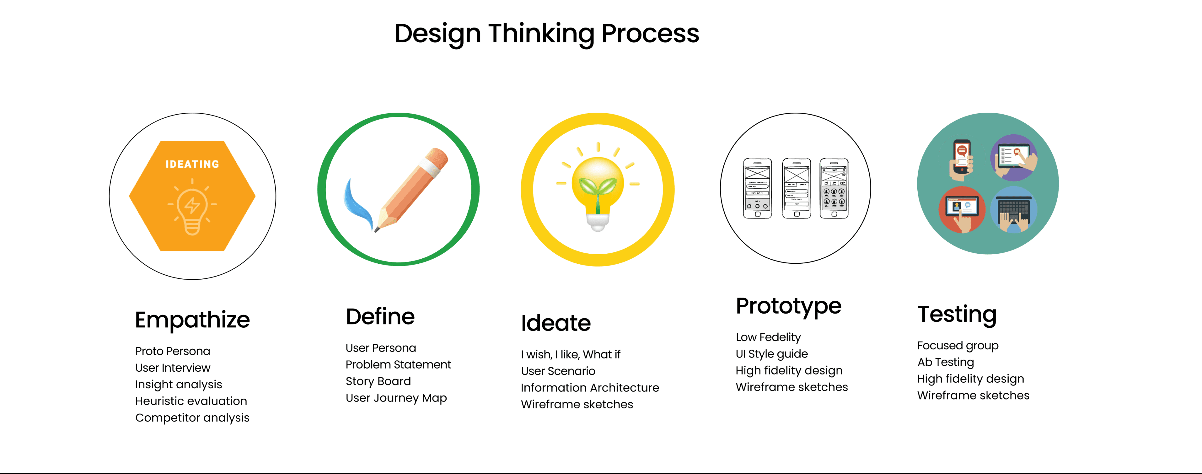
Double Diamond
Divergence
Divergence
Convergence
Convergence
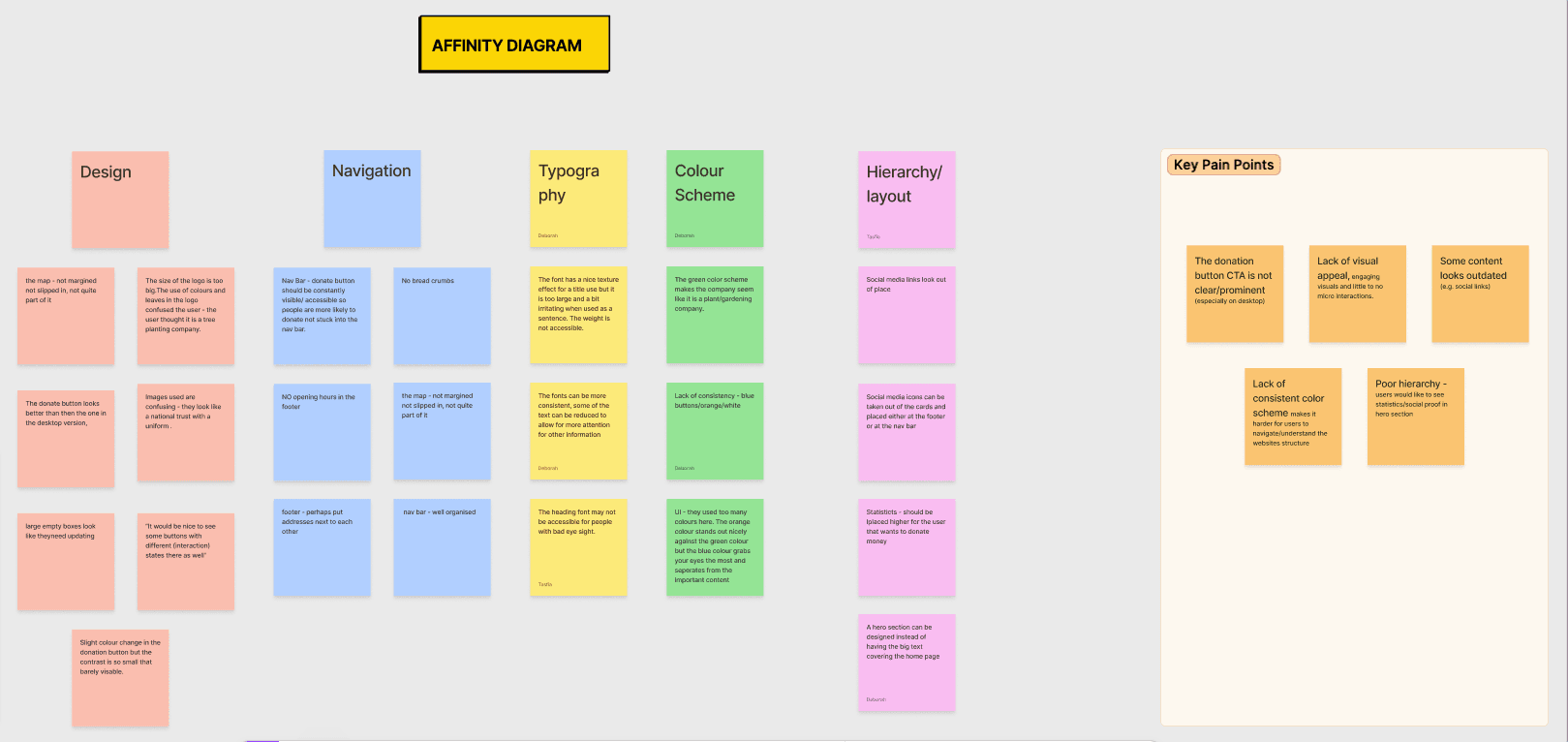
Affinity diagram (mother board)
Proto-persona
Interview
User persona
Empathy map
Competitive analysis
Heuristic evaluation
User journey map
Wire-flows
Low fi sketches
Low fi wireframes testing (AB)
Problem statement
Hypothesis solution
Crazy 8
Iterations
Hi fi iterations
Research
Solutions
UI
Uncovering initial insight and impression
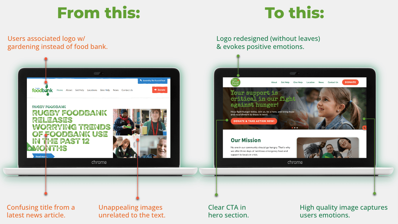
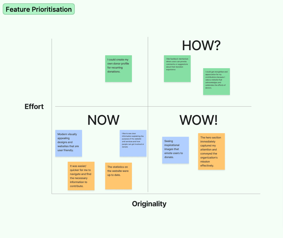
We started off by creating a proto persona based on our assumptions that the user (Tina) could be a single mother who is facing financial difficulties and goes to the website for help. However, after conducting 4 focused group interviews, we discovered that most users go to the site to give help instead of getting help. We decided to focus on those users (Sam) instead. Upon analysing insights we discovered several user pain points including, confusing images in the hero section, inconsistency in button design, and most importantly the website was not visually appealing or engaging.
Meet our Users
Tina Proto-Persona
Sam User-Persona
As a single mother, she faces the daily challenges of providing for her two children while navigating financial difficulties
Sam is a Gardener who is actively involved in his local community and has a strong desire to give back
Sam’s Pain point
Sam is experiencing frustration as he cannot find sufficient information on the website about Rugby Food-bank's mission
Sam time is limited. he wants the website to provide clear and concise information on how he can contribute and make a difference.
Lack of up to date social media links and a missing Instagram link.
Sam desires recognition and appreciation for his contributions. He values a website that acknowledges and celebrates the efforts of donors.
Sam’s Story
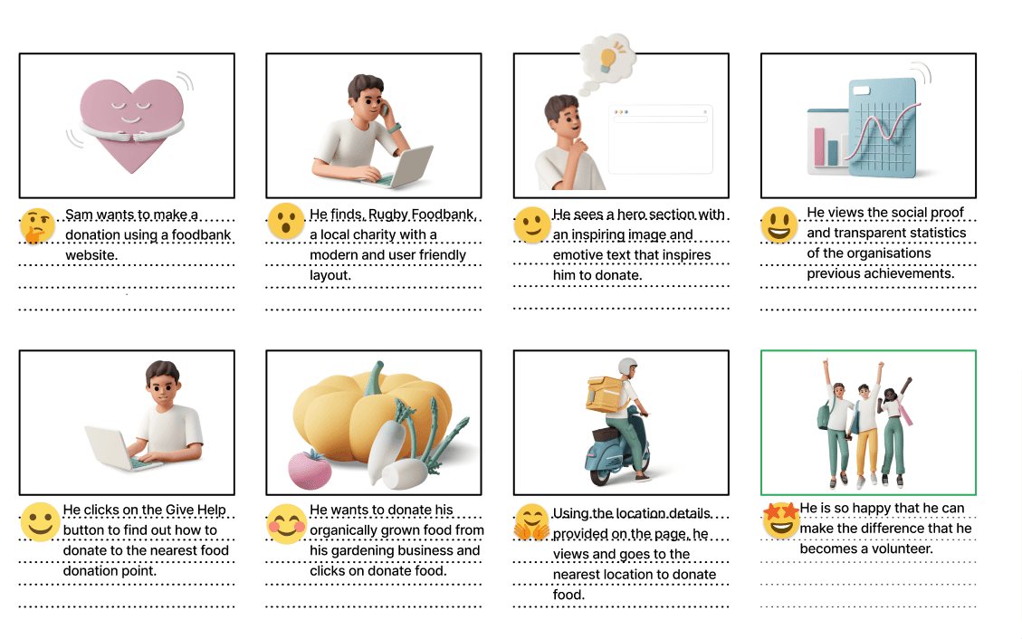
Sam wants tio make a donation using a foodbank website
He clicks on the give help button to find out how to donate to the nearest food donation point
He wants to donate his organically grown food from his gardening business and clicks on the donate food
Using the location details provided on the page, he sees the nearest location to donate food
He is so happy that he can make the difference and he becomes a volunteer.
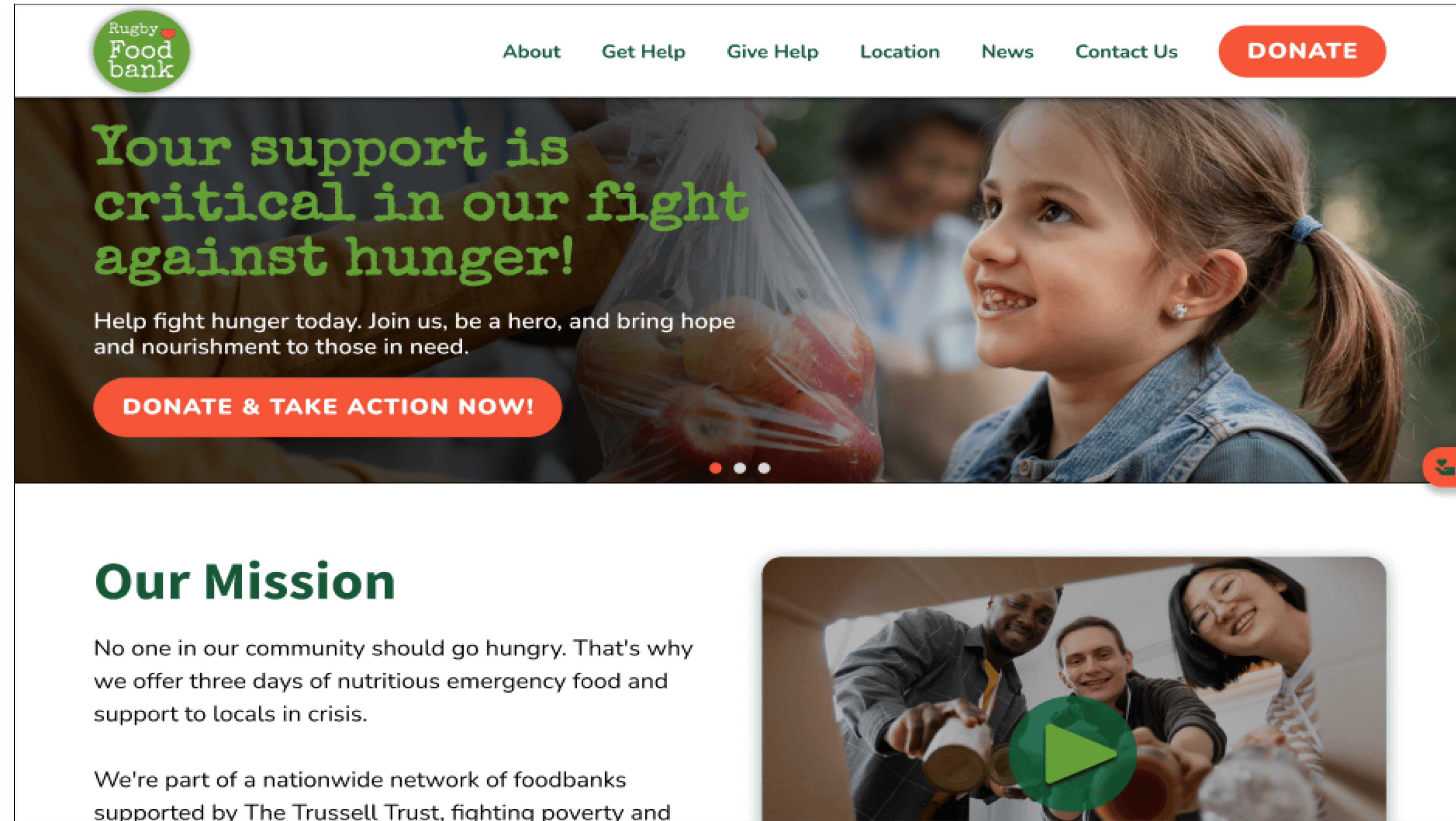
He finds Rugby Foodbank a local charity with a modern and user friendly layout.
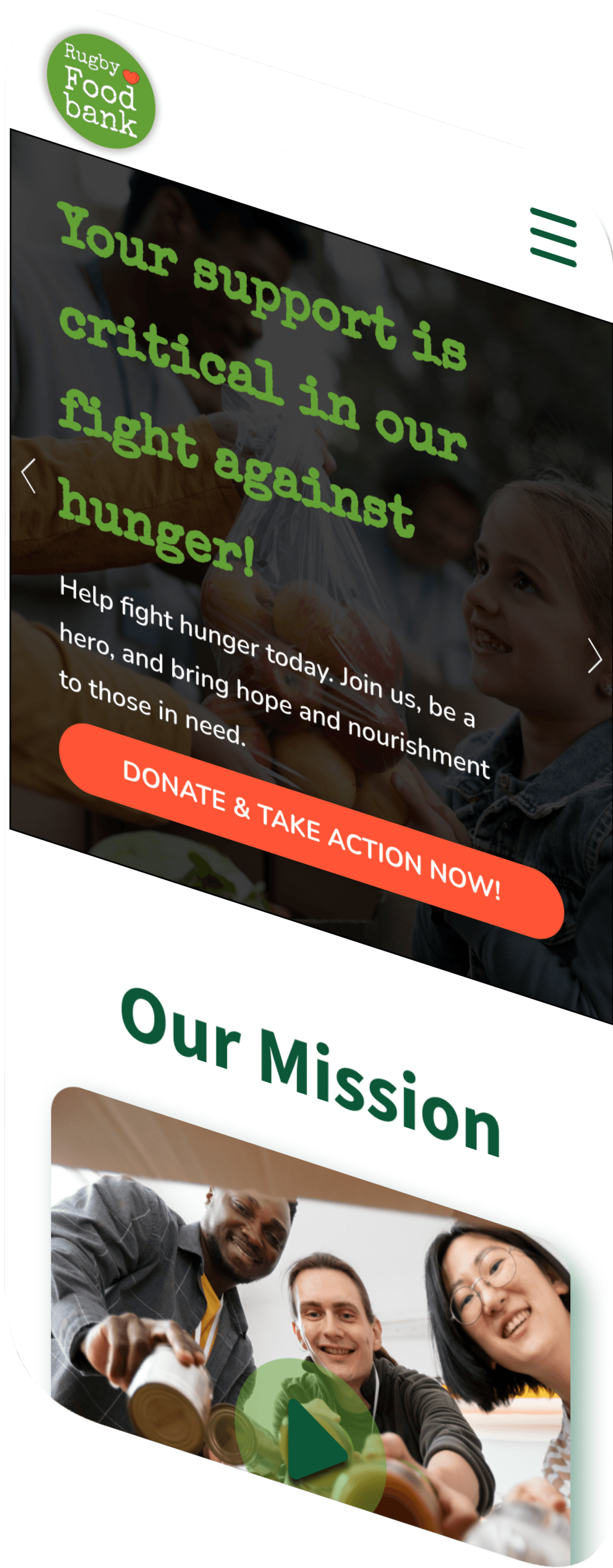
He sees a hero section with an inpiring image and emotive text that inspires him to donate
He views the social prove and transparent statistics of the organisation previous achievement
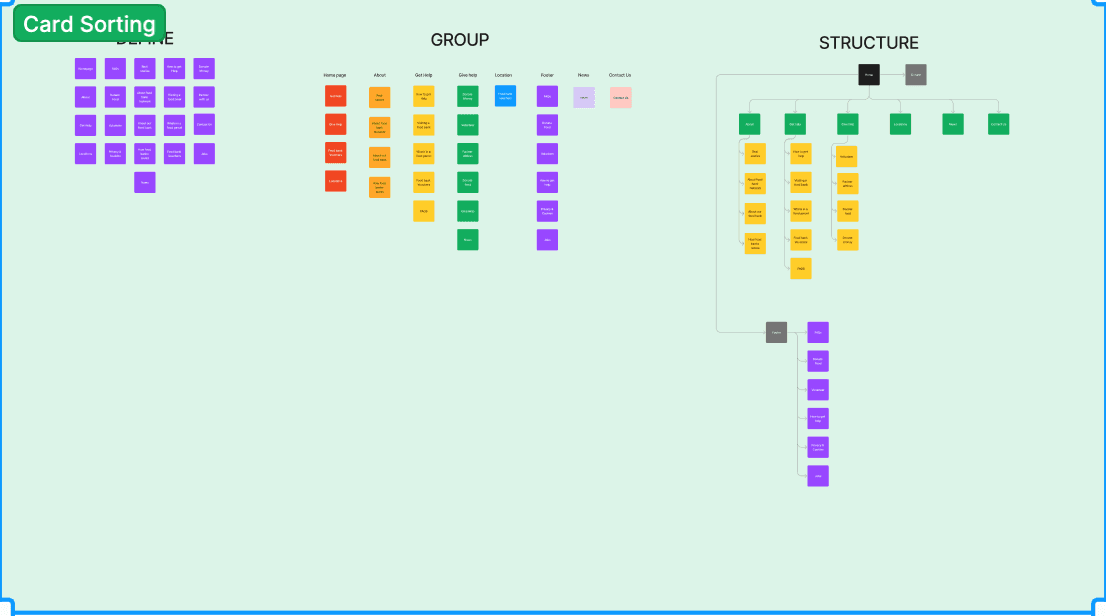
Card Sorting
DEBORAH
Home
About Me
My Portfolio
Contact Me
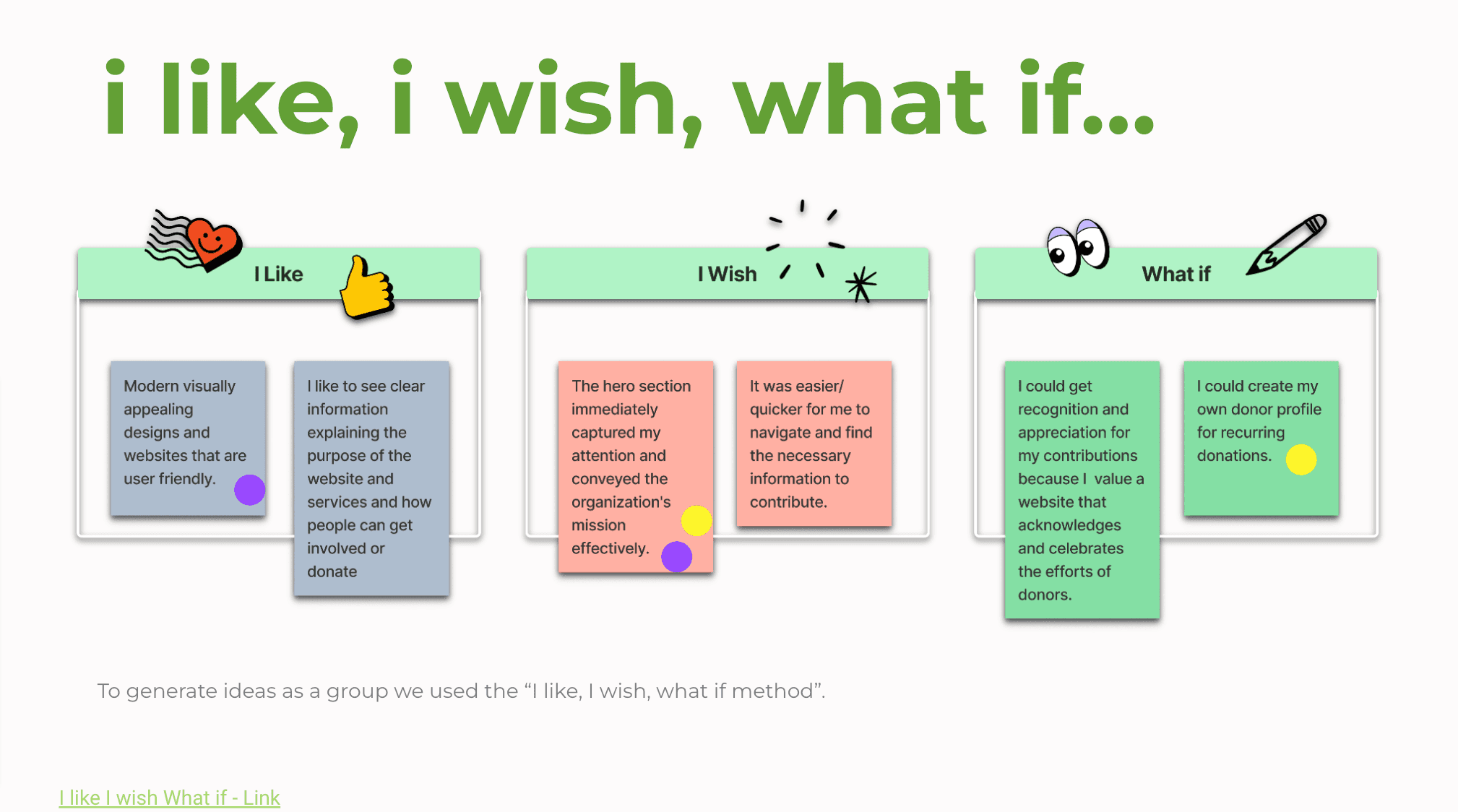
Crazy 8/Brainstorming
This was the most exciting part of our brainstorming, I particularly enjoyed making hand sketches within a short time, it was a refreshing experience, and we eventually came up with amazing design ideas.
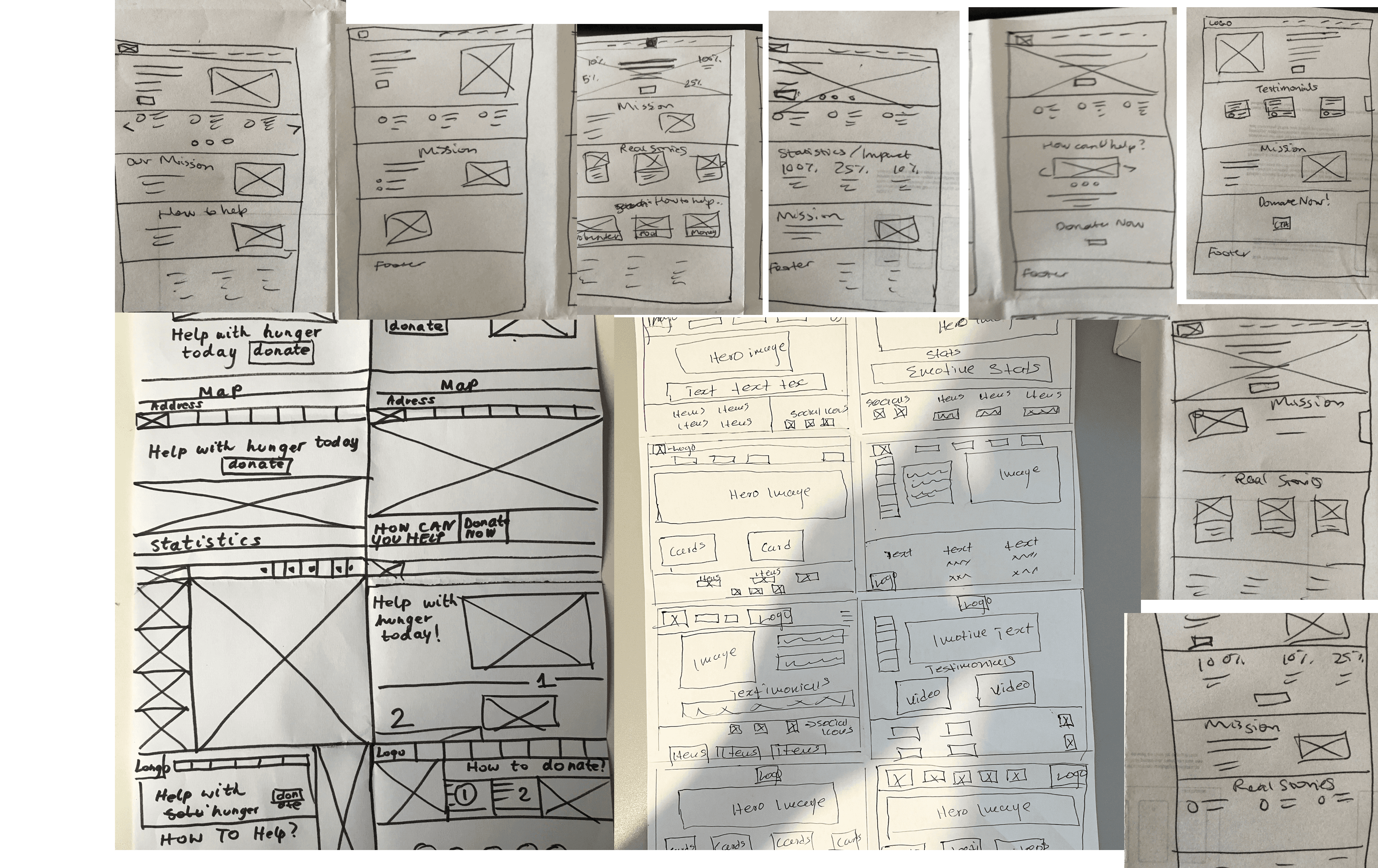
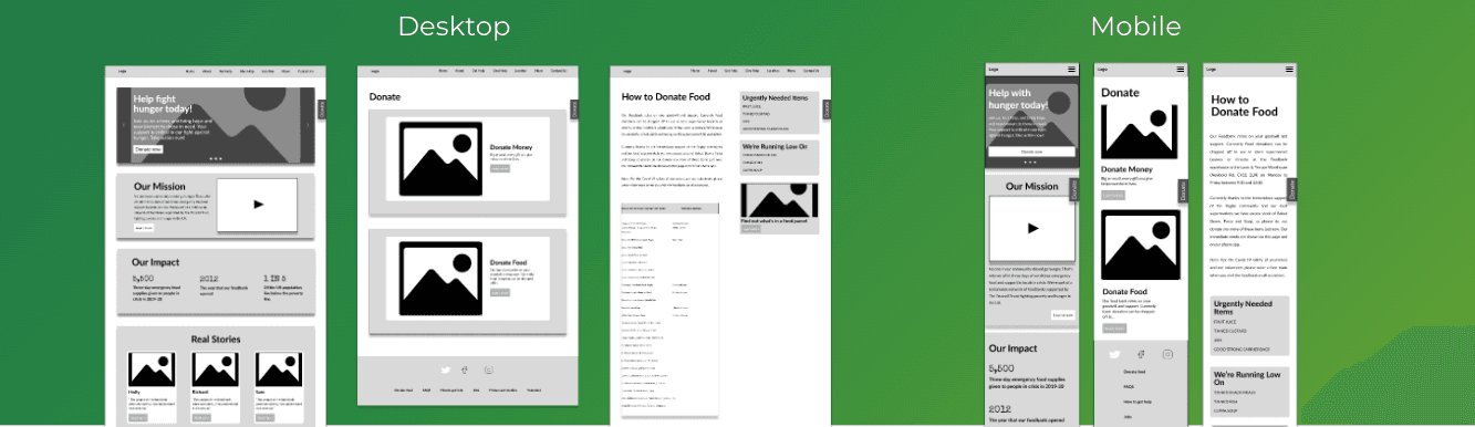
From sketches to low-fi
To enhance accessibility, we made the site responsive on mobile whilst making sure to keep the design and user flow consistent
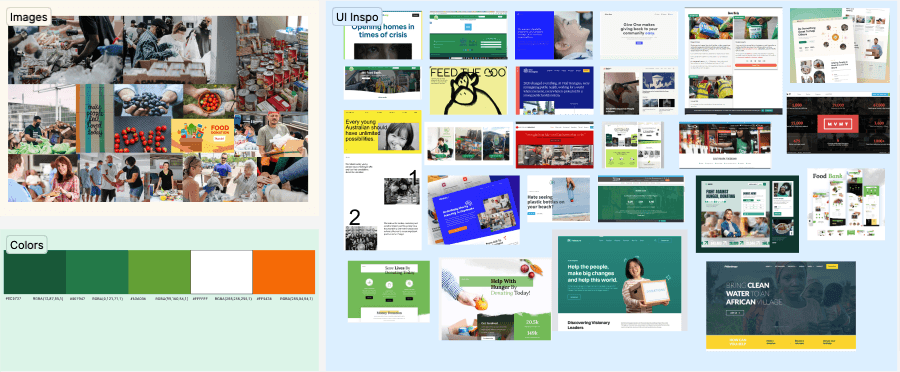
Moodboard and UI Inspiration
UI Style Guide
Colors
Green 01
rgba(12,87,55,1)
hsla(154,76,19,1)
#0C5737
Green 02
rgba(0,121,71,1)
hsla(155,100,24,1)
#007947
Green 03
rgba(99,160,54,1)
hsla(95,50,42,1)
#63A036
White 01
rgba(255,255,255,1)
hsla(0,0,100,1)
#FFFFFF
Grey 01
rgba(203,210,224,1)
hsla(220,25,84,1)
#CBD2E0
Red 01
rgba(255,84,54,1)
hsla(9,100,61,1)
#FF5436
Brown 01
rgba(80,59,7,1)
hsla(43,84,17,1)
#503B07
Typography
Typography Body Copy
H1 - Headline
H3 - Heading (cards)
h2 - Subhead
h4 - Subhead
Lorem ipsum dolor sit amet, consectetur adipiscing elit. Porttitor elementum cras neque, sapien. Leo enim bibendum ultrices in sed eu arcu magna quis. Lorem ipsum dolor sit amet, consectetur adipiscing elit. Porttitor elementum cras neque, sapien. Leo enim bibendum ultrices in sed eu arcu magna quis. Lorem ipsum dolor sit amet, consectetur adipiscing elit. Porttitor elementum cras neque, sapien. Leo enim bibendum ultrices in sed eu arcu magna quis.
“This is a how you would stylize a meaningful quote”
- Author
This is a regular link
(Special Elite Reg 48 px
(Special Elite Reg 24 px)
(Font Name Reg 40 px)
(Source Sans Pro Bold 48 px)
(Font Name Nunito Italic 24 px)
(Nunito Reg 16 px)
Iconography
Button States
Button States
button
button
button
button
button
Logo
Rugby
Food bank
Rugby
Food bank
– Logo on White
– Logo on Dark
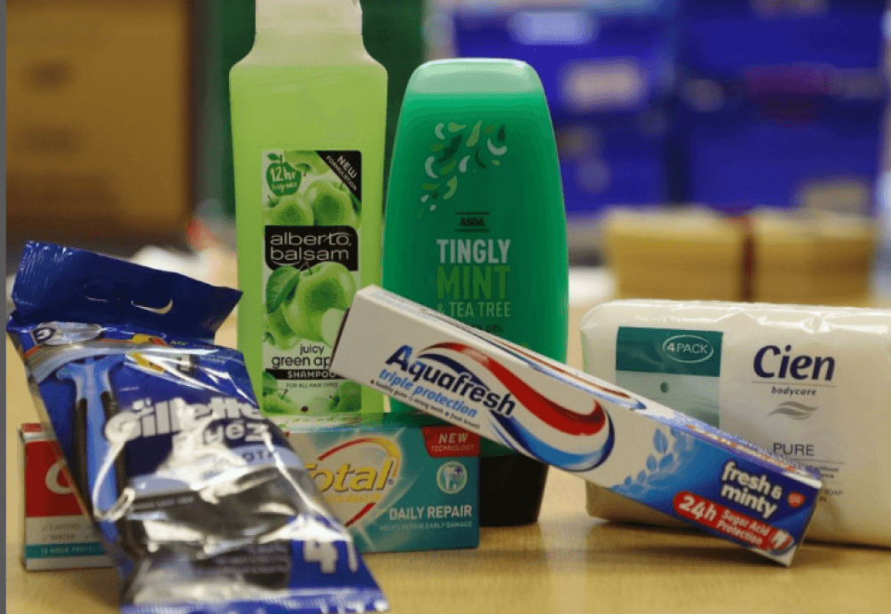
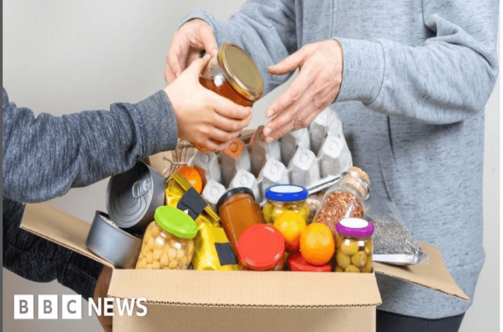


Imagery
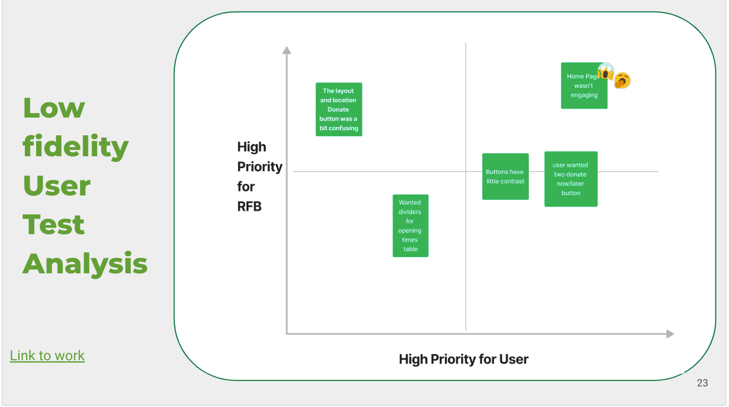
Low Fidelity User Test
From the low fidelity test, we deduced that the location of the donate button was a bit confusing for users and users/interviewees complained that the hero page wasn't engaging enough.
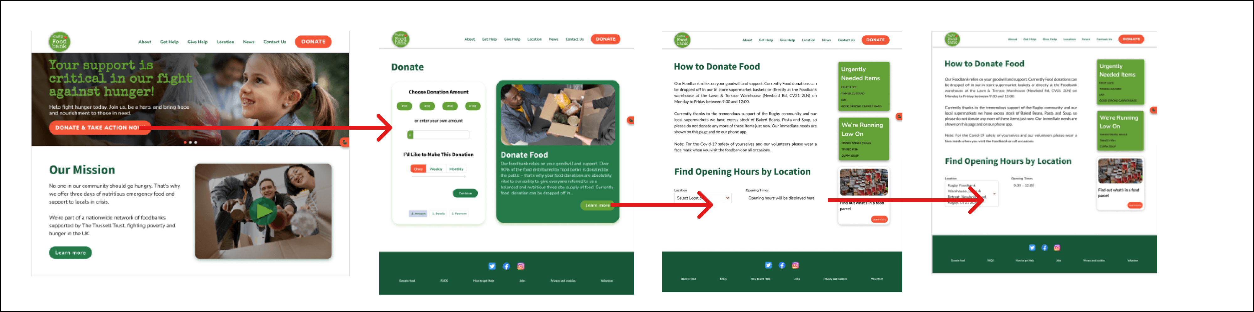
Wireflow
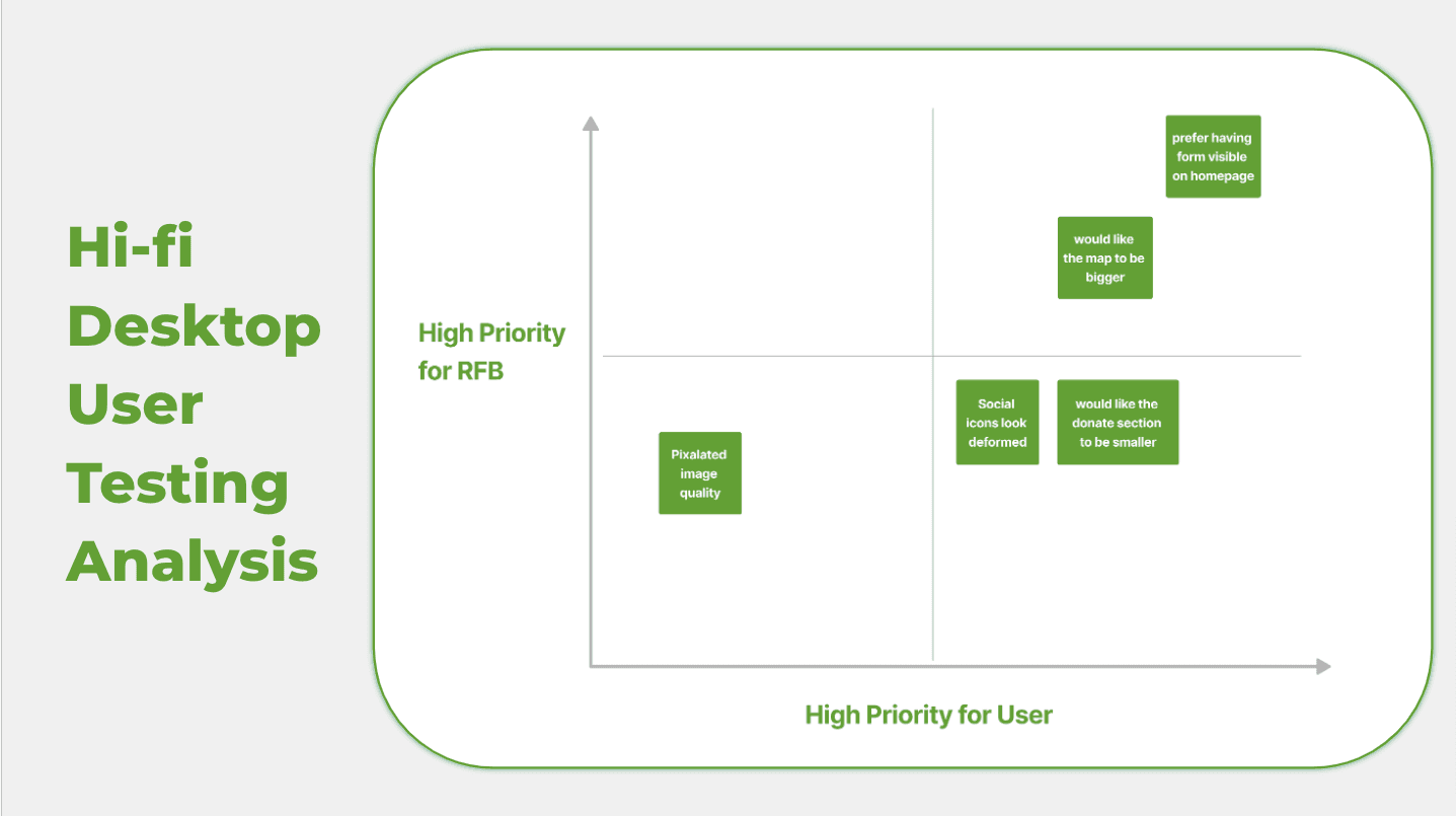
Hi-Fi Desktop User Test
After Iterating on the wireframe, we conducted a Hi-Fi user test where users preferred the donation forms visible on the page and they wanted the map showing the various location of the food drop off point bigger
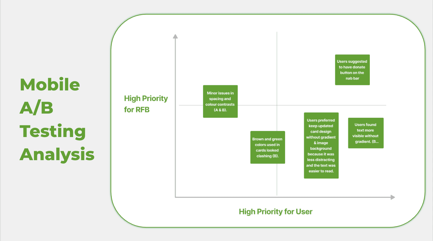
Mobile A/B Testing
Users preferred to keep updated card(B) design without gradients and image background because it was less distracting. User found text more visible without the gradient.t
A
B
A
B


Final thought
In conclusion, the research-focused project on understanding user behaviors while attempting to donate to a food bank has yielded valuable insights into the user journey and preferences. By placing a strong emphasis on research, we were able to gain a deep understanding of the challenges users face during the donation process and identify opportunities for improvement. Through user interviews, surveys, and usability testing, we uncovered key pain points and motivations that guide users' decision-making when contributing to a food bank. This data-driven approach allowed us to design a more user-centric donation experience that addresses the specific needs and expectations of our target audience.
Final Mockups
Next step
Regular maintenance updates will allow us to address any unforeseen issues, optimize the donation process, and ensure the platform remains user-friendly and efficient. Additionally, continuous improvement efforts will be an integral part of our strategy to adapt to evolving user preferences, technological advancements, and changes in the food bank landscape.
Deborah Omoniori All Rights Reserved
Data Analysis form Research survey